A hanging man candle pattern is a singular candle triggered by a break below it. The design can give the trader a “heads up” as to when the trend may change or run out of momentum in an uptrend. This is a crucial pattern that many people pay attention to.
What is the Hanging Man Candlestick?
A “hanging man candlestick pattern” is a single candlestick that needs a follow-through candlestick after it to show negativity. In other words, while it is a single candlestick, you need the market to confirm it. The candlestick will often show the overall trend rolling over in an uptrend. People often use the candle with other indicators to ferment a trading plan and opportunity. However, the great thing about this candle is that so many people understand what they are and will also notice them.
Characteristics of the Hanging Man candle
The hanging man candle is a single candlestick with a small body and a long wick underneath it. Identical in its shape to a hammer, the dependent man is at the top of a higher move. The candlestick form suggests that the sellers came into the market, pushing prices lower, but were repulsed. That being said, it is not a signal in and of itself.
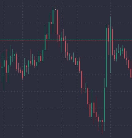
However, when the market breaks below this candlestick, the sellers have been aggressive and break short-term support. This can lead to a further continuation of a pullback and a potential trend change. Look at the image below; the white candlestick is a perfect “hanging man” example in the USD/CAD pair.

Massive “hanging man” in the USD/CAD market, PrimeXBT platform.
How Does the Hanging Man Occur?
A hanging man candle is an example of selling pressure coming into the market but repudiated as traders believe the overall long-term trend should continue to the upside. However, it is not technically a hanging man until we break down below the bottom of the campsite because it shows resiliency by the sellers.
What is a Reversal and an Uptrend?
A reversal is when the market goes from excess buying pressure to selling pressure or vice versa. A turnaround can be part of a more significant correction or a bit of a pullback in an existing trend, depending on your timeframe.
An uptrend is when buyers push prices higher over the longer term. The market continues to see buyers coming in to pick up value. Over time the market pulls back, and prices have been rising.
What Does the Hanging Man Pattern Look Like?
A hanging man is a candle with a long wick underneath it, but it is not necessarily a potential signal until its bottom is broken. It represents sellers coming into the market and losing momentum, only to turn around and take it back. A hanging man must be at the top of a move higher to show a potential continuation of the action, only to see the continuation broken through to the bottom. This will have some traders that bought that rally to lose money, and then it causes losses for them and even causes fear – something that influences trading.
Why Is a Hanging Man Pattern Bearish?
The hanging man is bearish because it shows that people anticipate an uptrend continuing and are willing to step in and repurchase the market. However, during the next candlestick, the sellers came in and sliced through that support, breaking the backs of the bullish momentum. Think of it as a failure pattern. You will also have to think about the traders that have been sucked into the trade and now are losing money. In other words, they need to get out.
Red vs. Green Hanging Man
Keep in mind that a hanging man pattern can be either green or red and does not make much difference one way or the other. In theory, the green candlestick could be a bit more “bullish looking,” meaning that if we were to break down below the candlestick, I could suggest even more psychology to the downside coming into play. Still, regardless of the color, it does not matter, as both mean the same thing.
Hanging Man vs. Hammer
The hanging man occurs at the top of a move higher, while the hammer candlestick occurs at the bottom lower. The hammer suggests support, and therefore as the sellers probed lower, breaking above the top of that candlestick that repudiated their downward pressure, shows that short people in the market are now starting to lose money. This means they will have to repurchase their position to protect their account, causing even more upward pressure.
In the Bitcoin example below, the lowest candlestick in the move down ended up being a hammer. You can see a wick underneath it, just like in the hanging man, but we broke above the candlestick, showing that buyers came in to support the market, and short sellers had to cover.
Hanging Man vs. Shooting Stars
The hanging man features a wick on the bottom of the candlestick after moving to the upside; a shooting star candle has a wick on the top of the candlestick. Both suggest that there will be exhaustion, but in opposite directions. The shooting stars show that the buyers could not hold the gains for the candlestick, so the idea is that if the bottom of the shooting star is broken through, all of those buyers and that candlestick are now starting to lose money and will have to sell their position to get out of the market.
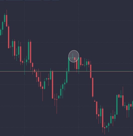
In a sense, these are similar signals, as they both are very bearish. Furthermore, they are both well-known by traders around the world. Look at the circled candlestick on the Dow Jones Industrial Average chart, showing a shooting star and the subsequent breakdown.

Example of a shooting star, DOW30 on the PrimeXBT platform.
Benefits of using the Hanging Man Candlestick Pattern
One of the biggest market momentum drivers will be when people have to cover existing positions. When a hanging man is broken to the downside, many buyers will have to start selling their work during a previous couple of candlesticks, adding even more momentum to the pullback.
Furthermore, one of the main benefits of using the hanging man candlestick pattern is that traders worldwide widely know it, so it has a little bit of a “self-fulfilling prophecy” sense. After all, you want the rest of the market to see the same thing you do.
How to identify and trade with the hanging man candlestick pattern
To take advantage of the hanging man candlestick pattern, you need to consider a few things to benefit from it. You first need to understand that it’s not 100%, meaning that sometimes the pattern fails. However, it does give you a hint as to what the psychology of the market may be, and therefore it can give you a bit of that “heads up” on when to start shorting or even when to start taking profit if you are already long in the market.
Step 1: Identify the long-term trend
Several indicators can identify the long-term trend, perhaps a trendline or even a moving average. Simply put, you need to see the chart going from one direction to the other. To use the hanging man, you will need to see an uptrend. In other words, prices need to rise from the lower left to the upper right. The most important thing you can do is follow the market and try not to overcomplicate the trend idea. As a rule, the trend on the higher time frames means more.
Step 2: Spotting your ideal entry point
It’s essential to understand your ideal entry point. This can be a Fibonacci level, a prominent, round, psychologically significant figure such as “$20”, or perhaps an area that previously had seen much resistance as a potential area of selling pressure. At that point, you wait for the candlestick pattern to present itself. That being said, understand there is rarely a “perfect setup” for a trade, so flexibility is possible. This can be considered an art form just as much as a science.
Step 3: Take advantage of the hanging man
Once you identify the area where you wish to place the trade, the next job you have is to take advantage of any situation. In this case, we are looking for a hanging man candlestick, so once the candlestick is formed and the market breaks down below the bottom of that candlestick, it’s time to start shorting. Many traders will put a stop loss on the other side of the hanging man candlestick itself.
Example of the hanging man candlestick pattern
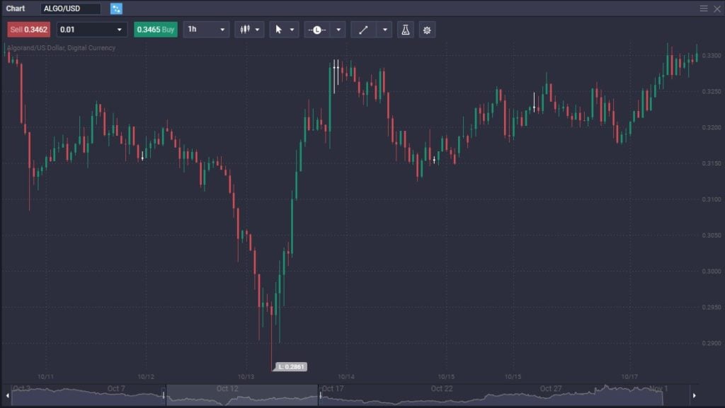
An example of using a hanging man candlestick pattern can be found in Algorand. Look at the chart below; two white candlesticks form as hanging man candles, followed by breaking down below that level to drop several cents. The stop loss is put on top of the two hanging man candlesticks that would have never been threatened, and therefore it looks like a classic setup. The $0.33 level was an area where the market had seen resistance previously.

Algorand hanging man candles on PrimeXBT platform.
Is a Hanging Man bullish or bearish?
Hanging man is bearish because buyers are starting to lose a grip on the market. Suppose we continue to see selling pressure below the bottom wick of the candlestick. In that case, it has everybody running for the exits, which could potentially be losing money over the last couple of candlesticks. Ultimately, it is a momentum shift, suggesting that people could be heading for trouble.
Why is Hanging Man bearish?
The hanging man is bearish because people will have to give up their bullish holdings because they are either losing money or starting to see profits vanish. The assumption that the market will continue in the same direction is beginning to see cracks in the surface. Therefore, many people will be very cautious about entering the market.
What does the Hanging Man candle indicate?
The hanging man candle indicates that the market is trying to continue going higher but has struggled to keep up the momentum. Remember, markets are built on speed over the longer term, and the short-term moves can give you a bit of a “heads up” as to when the trend or the momentum is failing.
What is a hanging man bearish reversal?
A hanging man bearish reversal happens when the market pulls back for a candlestick but then turns around to show signs of life. The long wick at the bottom of the candlestick suggests that the longer-term trend should continue to increase. However, instead of doing that, the market breaks below the bottom of the wick, smashing the short-term support, and kicking off more selling as traders have to square their accounts.
The content provided here is for informational purposes only. It is not intended as personal investment advice and does not constitute a solicitation or invitation to engage in any financial transactions, investments, or related activities. Past performance is not a reliable indicator of future results.
The financial products offered by the Company are complex and come with a high risk of losing money rapidly due to leverage. These products may not be suitable for all investors. Before engaging, you should consider whether you understand how these leveraged products work and whether you can afford the high risk of losing your money.
The Company does not accept clients from the Restricted Jurisdictions as indicated in our website/ T&C. Some services or products may not be available in your jurisdiction.
The applicable legal entity and its respective products and services depend on the client’s country of residence and the entity with which the client has established a contractual relationship during registration.


